GV Design Sprint
an app that streamlines the cooking process for inexperienced at-home chefs
Bootcamp: Springboard
Design Sprint
Date: 1/10/2022
For this project I was given a challenge through the website Bitesize UX to help a Startup called Savr with their new cooking app. This app provides access to hundreds of recipes and tips for at-home chefs, but recently has received negative reviews regarding the usability of the recipes.
Savr received feedback that included the preparation, order of steps, as well as how users implement new techniques that they were unfamiliar with. As the designer, I was tasked with creating a solution that would make user’s experience following a recipe easier to follow. For this design challenge I was given a series of design constraints.
I was told that I must assume that the recipes are currently written as a very basic series of steps and my solution should be designed as a feature native to the Savr Recipe app. Lastly, I was given a design constraint that informed me I should only concentrate on the user’s experience while cooking rather than the experience of choosing a recipe.
User Map
To start off my research I gathered the data provided to me and created a map of a user’s experience. This map helped me visualize the user’s journey and helped me discover any pain points or edge cases I needed to consider.
Competitive Analysis
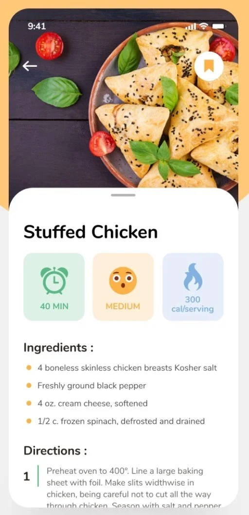
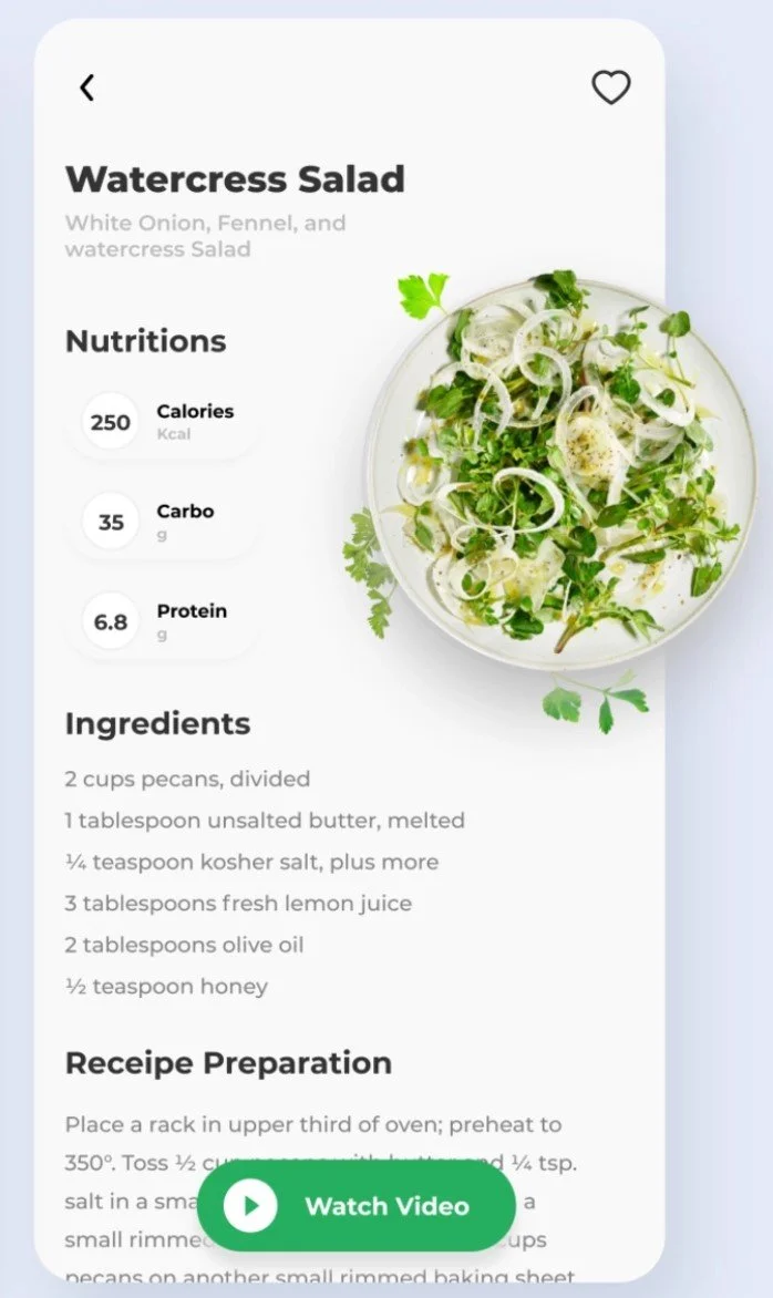
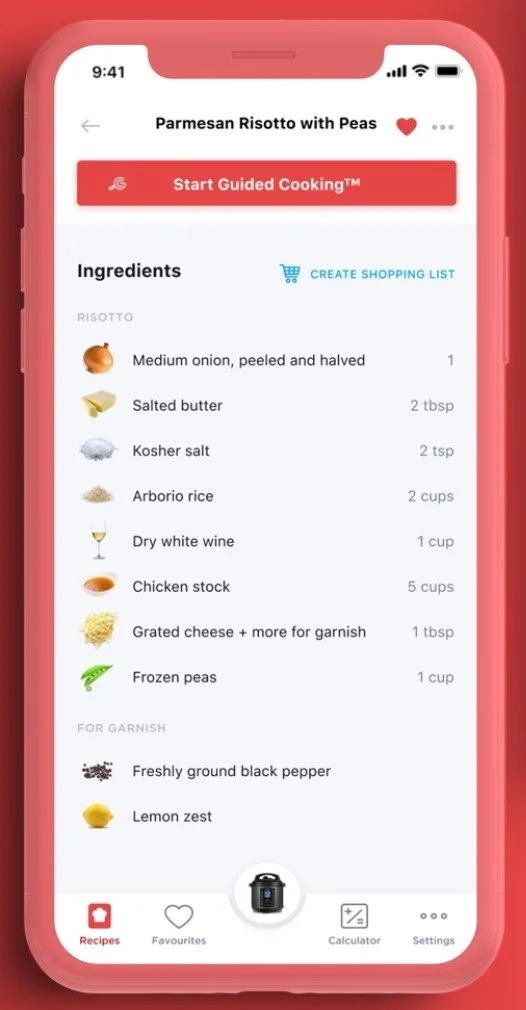
Before I began iterating I researched what patterns competitors were utilizing and I found interesting data that I included in my project.
Information Architecture
Preparation
Imagery
An important element that I found in many UIs was information regarding the skill level of a recipe, how long it will take, as well as how many it will serve. Providing this information up front sets a precedent for the user and allows them to better prepare for cooking.
An interesting choice I found in one UI was the inclusion of prep work before the user begins cooking. This is common practice for many chef’s and allows for a more fluid and stress-free experience while cooking at home.
Lastly, I found that many recipe UIs included imagery next to new ingredients. This design element is very beneficial to users unfamiliar with certain ingredients and would often help them look for those ingredients when shopping for the recipe.
Crazy 8s
Proceeding the competitive analysis I completed an exercise to quickly explore eight different solutions for various pain points that the app received. I gathered the data from my previous research and took eight minutes to quickly iterate on my ideas. By doing this exercise I found that the most important screen was one that included Prep Work because if the user prepares their recipe effectively cooking will be much easier.
Iteration of Critical Screen
When approaching this iteration I new that there were a series of design elements I wanted to include in order to optimize the user’s cooking experience. Those elements included a clear list with dividing lines of ingredients and quantities, imagery for each step that will give user’s an idea of whether or not they are on the right track, and lastly the option to complete some Prep Work steps while they are cooking.
Storyboarding
After iterating on the most critical screen, I followed up that exercise by drawing a storyboard of the user’s experience. This storyboard starts by the user choosing a recipe and then reading the important elements such as it’s level, time, and serving size. Next, they check off each ingredient when they are done and click on ingredients that they are unfamiliar with for more context. Once they have taken out all of their ingredients they begin reading the prepping instructions. If they are unfamiliar with a step, they are able to reference the image below and check it off when they are done. They then move on to the recipe and continue checking off steps as they go.
Wireframing
After iterating and storyboarding, I moved onto wireframing my ideas. This helped me organize the information architecture of each screen in order to take into consideration how the user flows from one screen on to the next.
Usability Testing
Before moving onto creating a low fidelity prototype, I tested my designs and found a few key elements that I implemented into my prototype of which included….
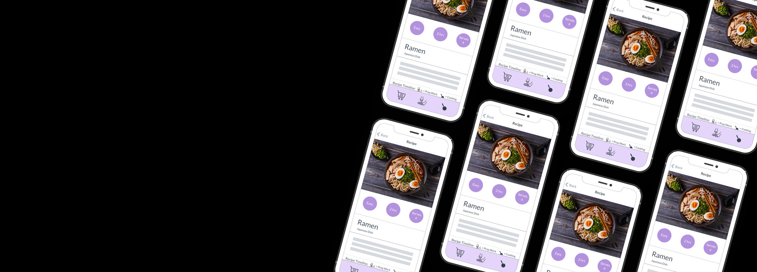
Recipe Timeline
Icon Recognition
Check Boxes
During testing I found users liked a suggested timeline if the recipe was going to recommend doing one step while the other is cooking. This helped the user stay on track and experience much lower amounts of anxiety as they continued.
Users were often having trouble recognizing what each icon on the bottom navigation bar meant. In order to create more recognition I decided to use the icons more frequently within the UI to repeatedly communicate its meaning.
Recipes often have very long lists of ingredients and many steps to follow that can cause at-home chefs anxiety. I felt one way for users to reduce their worries was by allowing the opportunity for many micro positive interactions throughout the UI. Users are able to check off each ingredient that they have and every step they have finished in order to create the impression of an accomplishment.
Low-Fidelity Prototype
Using the data I had gathered in my research I used the website Marvel to create a clickable prototype that helped me explore the implementation of my new design elements.
Conclusion
The google design sprint taught me the importance of breaking down design thinking in order to cohesively create a product that leaves a user with a positive experience. Originally, I struggled with visualizing how the user would move throughout the app, but after storyboarding and creating user flows I was able to optimize the experience and ensure that the user doesn’t get lost along the way. Moving forward, I will be referencing this design sprint to inform my process on future challenges in order to create harmonious products that users can enjoy.


